9 Best UI/UX Trends 2023
Netizens today consume a huge amount of content. According to the latest statistics of the Website rating, an average internet user spends 6 h 43 min online every day. A lot of websites are your potential competitors in the fight for the users’ attention. At the same time, their content is very diverse. To win this battle, you absolutely need to have a clear brand identity, a unique style, and a memorable website that thoroughly represents your values. Plus, your site should be an up-to-date illustration of the latest user interface (UI) and user experience (UX) trends. Let’s see which UI/UX design trends 2023 will bring us!
1. Funky design
Our world has suffered a lot over the past years – so, all people, regardless of the search query, are united by the desire to distract from the negative. Funny web design will perfectly cope with this task. This UI/UX trend is built on the principle of more fun & less serious official stuff. Opting for a funky style will make your site eye-catching and force users to stay and explore it deeper. From the development point, an extraordinary design format with fancy patterns, crazy pictures, and the most unexpected colors will give a fresh breath for your design team to develop their potential.
There are several ways to succeed in it:
- Optimistic form. This includes light colors and light fonts that are associated with joy.
- Use funny and positive pictures.
- You can also play with humor in UX design. Not only the appearance of the site can be funny, but also its menus or interactive blocks.
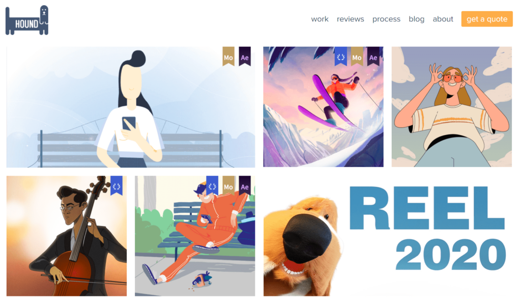
The Hound animation studio designers have done a great job on the funky UI/UX design. It is in light colors, and the inscriptions use a simple light font. On the main page, you can see interactive stories with smiling faces, which at the same time are clickable links to projects from the portfolio. And the dog from the company’s logo comes to life in a funny animated block, where it plays with a ball, involuntarily causing laughter and a desire to watch the video to the end.
2. 90s nostalgia
We like to see the funky trend as a precursor of this one, but the 90s are more than that in terms of design. What brings us to reminiscing those good ol’ times? It’s mostly the authentic graphics – bright colors, use of real-life imagery, pop culture elements, collage pictures, even recognizable typography style. Warms your heart as you read it, right?
Most of the 90s nostalgia is concentrated in graphic design, but the trend also affects UI/UX. It reflects itself in the UX design trend as a tendency to simple and even primitive (in the best sense of the word!) forms and dialog popups. Think of what would it look like – something like this, right?
Well, that’s from, like, today (late 2022, to be precise) – but it does resemble the sites from the early days of the internet, doesn’t it? Very simple and seemingly doable with a standard tool like Paint – totally characteristic of that era. And it fits well into the overall tendency to simplify! So, we see the 90s vibe in interfaces as a promising design UI/UX trend for 2023.
3. Modern color solutions in UX/UI trends 2023
There are several bright trends in web design in the context of the palette. We are confident that they will stay relevant in the new year. Some of them are:
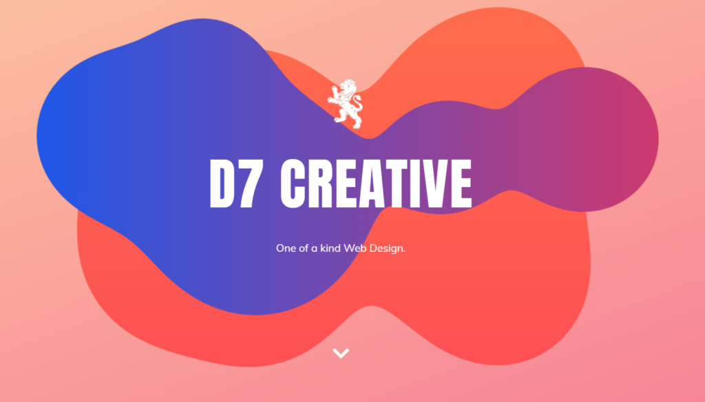
Gradient
Of course, the gradient has been around for a long time and has been actively used before. However, in UX/UI Trends 2023, we refer not only to a smooth and shining gradient but to a more grounded and grainy one, too. Different degrees of granularity can create interesting texture effects, don’t be afraid of trying different ways. In addition to the background, the gradient can be used in the interface design, for instance, in buttons, text, or interactive menu sections. The gradient itself, or the Aurora background option, is often associated with modern design technologies, cyber universes, and a bright future.
Neon on dark
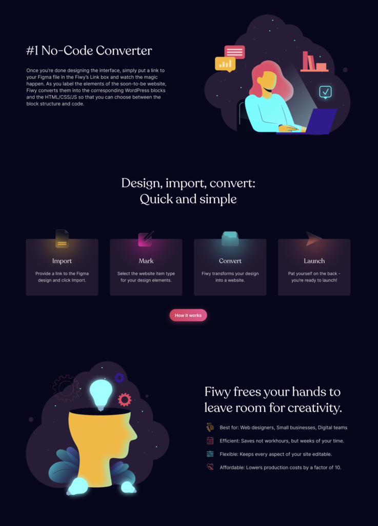
The neon glow looks very attractive both on billboards and in the design of a website. On a dark background, a bright neon glow looks much more advantageous. That is why they entered the top UI/UX trends in pairs. Neon design is similar in essence to a gradient – they are both associated with futurism and technology.
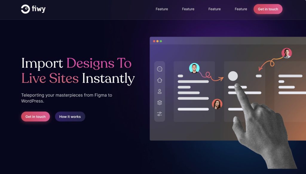
A great example of both of these UI/UX trends will be the fiwy.io website. The designers skillfully combined the modern gradient palette and neon. The first one is in the design and text, plus the neon illustrations on a dark background. The fiwy.io website also has a stylish interface designed in accordance with the latest user experience trends.
Surely, you have studied not only our post and met, among other trends, a dark theme in the design more than once. And of course, the dark/light theme toggle is popular, but do not associate it with the innovations and UX/UI trends 2023. This has long been the norm and routine of web design.
4. NFT and modern technology adaptation
Web design ideas often mirror popular trends from other fields. Without straying far from the topic of technology, NFT and VR/AR can be singled out among the UI/UX trends 2023.
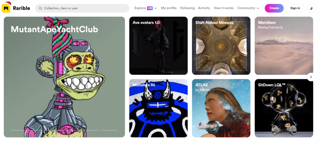
NFT (non-fungible token) is a virtual work of art that has no analogs due to its binding to the blockchain. However, in the context of web design, we can interpret this trend differently. Among other things, NFT is a very easy-to-create object that anyone can make. Thus, art becomes accessible to everyone, and a much larger number of phenomena become art. The same is true in UI/UX design – any idea can become a successful design for a website, from 3D avatars to pixel pets.
By the way, the word NFT itself was officially recognized as the word of 2022, according to the Collins Dictionary. So, if you are tracking the conversion of your site and SEO algorithms, it is better not to pass by this UI/UX trend.
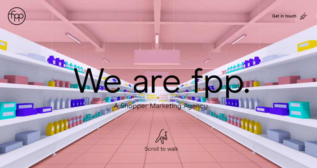
The web design trend for virtual reality is more related to the user experience. It constantly reminds us that technologies do not stand still: the number of dimensions is growing, and the metaverse is spreading. It means that we must learn to make websites adaptive for any kind of new device. Therefore, now is the time to gradually introduce VR elements into your interface. Look how it is done on the FPP website.
5. No-code tools for UI/UX design
Even if you are not familiar with the no-code format, the time to start this journey is right now. At first glance, it may seem to you that such a no-code format limits the functionality of the site and negatively affects the user experience. In fact, it empowers web designers to build professional, responsive, and custom websites in a completely visual canvas with no code. In addition, there are many no-code builders that you can figure out on your own. You can learn more about all the strengths and weaknesses of no-code builders in the post What to Avoid in No-Code Builders and When.
An alternative option for creating a cool website with high UI/UX standards and in accordance with the latest UI/UX trends is to ask professionals. You can choose a service for transforming your design by a team of experienced developers, as in the Figma2WP project, or turn to an automated platform that converts the design into a full-fledged website, as Fiwy.io.
6. Typography experiments
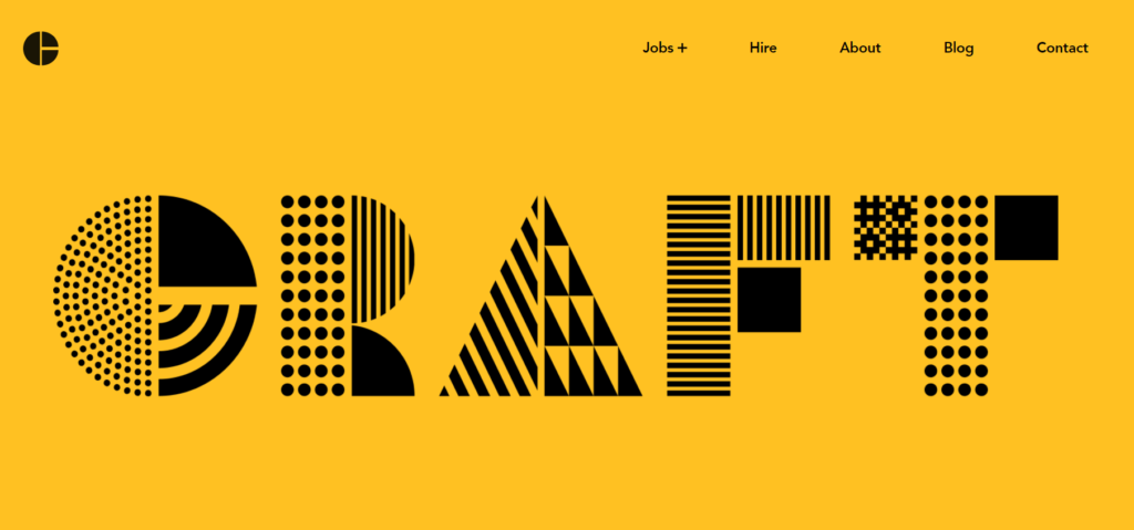
The riot of fantasy among UX/UI web design trends 2023 has affected typography, too. Unusual sizes dominate. Large and bold fonts are now not only a meaningful text or title but also a whole graphic element of the overall design. Such a user interface component absorbs visitors into the site page in all facets: from the visual and content sides. In addition to bold static solutions, this web design trend covers mixed dynamic variations of fonts containing animations or changing shapes.
The Craft Agency website has an entertaining example of a creative game with the appearance of the text. A huge inscription with the name of the company on the main page is made in an original font consisting of several blocks. As soon as the page loads, the blocks start moving randomly, and this gives the font a fresh coat of paint. Speaking of colors: when you reload the tab, the page changes its background color making the font Scrollableget a fresh look every time.
7. Complex interactivity as a UX trend 2023
Let’s get back to basics and remember one of the most important goals of web design – to attract attention. The trend for interactivity in UI/UX design is what you need. Default static information stops being interesting to the user immediately after reading it and receiving the necessary information. If you want to increase sales and attract attention to your brand, this format does not suit you. Your task is to make sure that customers do not want to leave your site. Different variations of interactivity will help with this.
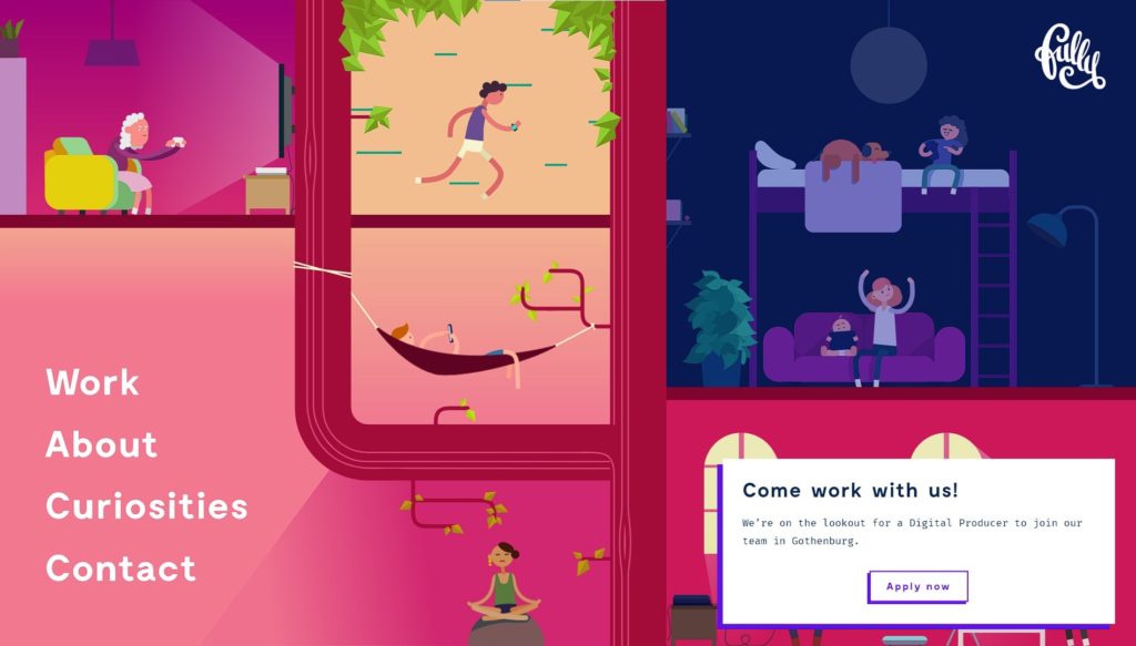
We have already discussed fonts using animations in the previous section: there are also a few more options. Pay attention to any design elements that may interact with the site visitor and change depending on their behavior. For instance, there are six dynamic blocks on the Fully Studios website. When the user hovers the cursor over a specific part of the page, various entertaining functions occur inside. An athlete is running in the central block and when you hover the mouse over his window, time in his universe slows down, with the right block you can arrange power outages, etc. Furthermore, one of the interactive blocks is directly connected to the site menu. When you approach the cursor over any line, night falls in the meditating girl’s block.
You can learn more about the benefits of interactivity and tools that can improve it: 7 Interactive Website Features To Increase Conversion →
8. Scroll them all!
Scrollable elements like sliders, blocks you can scroll into, etc., help in user engagement. The most effective representation of this UI/UX trend is when the text scrolls smoothly in a not busy part of the page. It is very important to choose the identical text for interaction. It should be a readable phrase in pleasant colors and decorated with a clear font.
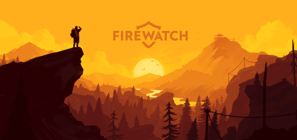
A good example of scrollable parts in the user interface is presented on the Firewatch website. The developers chose the game logo with its name as an interactive scrollable element and placed it in an empty zone in the center of the picture. When a client scrolls down the page, the landscape remains untouched, but the logo scrolls down as if the sun is sinking below the horizon at sunset.
9. Split-screen style
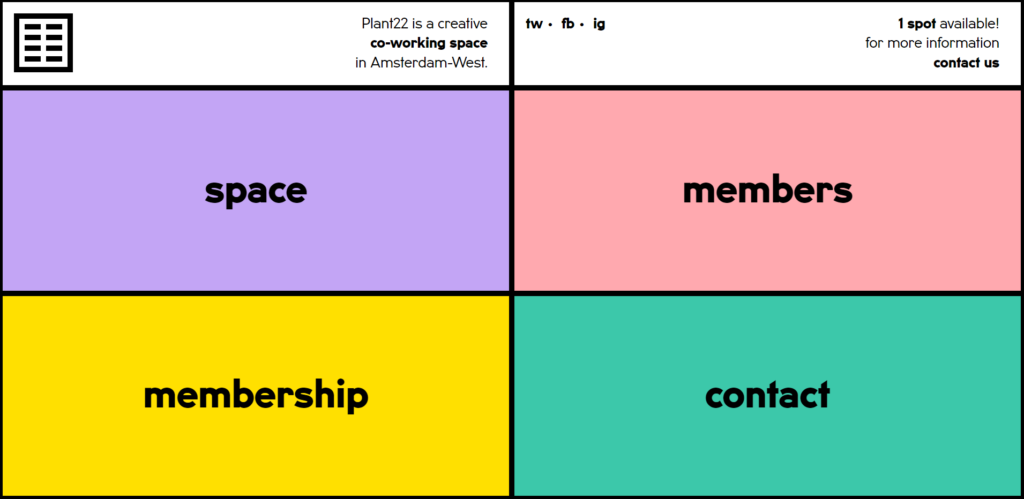
If suddenly you are looking for ways to diversify the space of the web page or change the color scheme – your solution is in contrast separation by blocks. This UI web design trend will allow you to experiment with the palette because each block needs its own separate color. You can also diversify the user experience and use individual blocks not only as design elements but also as separate semantic blocks of content.
The Plant22 space website uses the block design for its menu. Each square is separated by bright contrasting colors and contains a link to another page of the site structure. This design looks comfortable to use and is bright and memorable from the visual side.
UI/UX trends 2023: End note
As you may have noticed from some of the examples given in the post, many of the listed UX/UI trends 2023 can collaborate with each other. The main message is not to be afraid of experiments, but to avoid overloading your design. Your audience will definitely appreciate your desire for self-development and keeping up with web design trends.
Of course, it will be easier to use these techniques for those who plan to create a website design from scratch. If you have a ready-made functioning website and are thinking about updating it in accordance with the latest web design trends, first check out the Redesign or Design Update post – Which One Does Your Website Need? post. And if you’d rather get help from a pro, our web design experts are always at your service. You’re welcome to check out our web design & web dev portfolio with awesome WordPress stuff. And see you in 2023!
More From Our Blog
Elevating Your Online Presence Through Engaging Social Design and Community WP Building a vibrant community WP (WordPress) site is increasingly crucial in the digital age for brands aiming to foster trust, loyalty, and dynamic interaction among their customers. By integrating Figma2WP Service solutions, businesses can transform precise figma social design prototypes into powerful WordPress-based discussion Read more…
Designing Engaging Virtual Events with Figma Templates Virtual sessions and webinars have become central to business, education, and community engagement worldwide. As organizations seek smoother, more professional ways to host online events, leveraging powerful design tools like Figma can elevate every aspect of your webinar—from invitation to follow-up. Whether you are building your webinar landing Read more…
