
UX Best Practices For Scrolling: Infinite, Horizontal, and Parallax
The more information we see on the Internet, the more we unconsciously absorb. Have you noticed how you go on social networks just to check messages, your attention gets intercepted by a picture with a cat, … *a gap in memory*, and then you realize being flipping through the news feed for an hour without any special purpose. And it still doesn’t end.
Scrolling is an important lever for your audience to interact with the information on your site. Also, it’s a navigation tool among the content on the page. The most significant task in the context of scrolling is to ensure comfortable use and accessibility. In addition, it is essential to choose the right type of scrolling for the needs of a particular site. In this post, we’ll look at three types of scrolling best practices.
The table of contents for better navigation:
Types Of Scrolling
Selecting the type of scrolling for your site can be compared to selecting a character in a computer game. You need to focus on your goals and choose the option with the most suitable characteristics for these purposes. Some of them are very individual and, if used incorrectly, can harm rather than improve your website. Read on and make your choice carefully: we pulled together a scrolling checklist at the end of this post to help you.
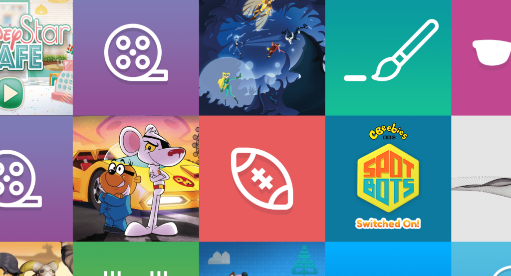
Infinite Scrolling
Infinite scrolling is an approach to the design of the website, which implies continuous loading of content as you move down the page. This technique is popular among social networks. There’s no difference in the importance of a separate unit of content, so they are equally broadcast to the user.
The classic type of scrolling. Information moves up and down, and it’s not always clear whether this chain has an end. It is used as a tool to demonstrate the variety of content on the page.
The need to constantly scroll to get new data awakens the spirit of adventurism and curiosity in the user. On the other hand, it can make the audience less attentive and position your site as a time-killer.
Infinite scrolling: Benefits
The best things about infinite scrolling are:
▫️ Massiveness
The ability to fit a huge amount of content on one page.
▫️ Availability
Fast delivery of information to the consumer due to the absence of a hierarchy of content.
▫️ No limits
The user gets the opportunity to study the content endlessly, without fear that someone restricts the search results.
Infinite scrolling: Potential disadvantages for UX
However, there are many pitfalls in using this type of scrolling, which can pose a danger to the comfortable use of your site:
▫️ Dispersed content display format
If the user came to the site in order to find specific information or compare several items of the assortment, they will likely fail to find what they need fast. When people scroll through a long canvas of information, their brains don’t have time to focus on a specific object. That’s why it’s literally impossible to remember any details about an object to compare it with the one located below in the endless line of content.
And if the visitor still wants to go back to the previous object they liked, it’s really hard to remember in which part of the infinite scrolling they saw it.
▫️ Frustration and psychological pressure
The user searches for an answer to their specific question, and in response receives only an endless chain of information in which the eyes run away. In addition, FOMO (fear of missing out) is a common problem among active Internet users. This is a psychological effect in which a person is afraid of missing some important information, so they scroll the news feed endlessly in search. Such people are truly sucked into the funnel of infinite scrolling.
▫️ Difficulties in orientation
When the end of the page is clearly marked, it’s easier for the user to distribute efforts to study all sections, with emphasis on the most significant. And upon completion of studying the content on this page, a person feels a sense of satisfaction from the completed task. In the case of infinite scrolling, there’s no clear end of information flow and users will leave the site with an unpleasant feeling of non-completion. In the future, this may become a negative coloring of your company’s associations.
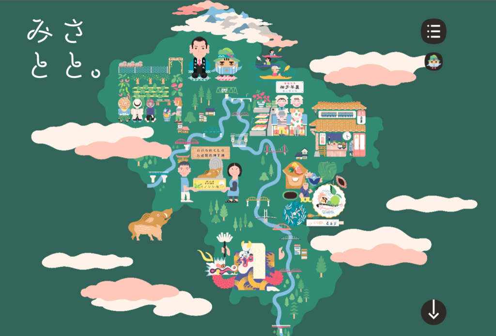
Horizontal scrolling
The kind of scrolling that changes the idea of orientation. Horizontal scrolling is the kind of navigation bar that moves not like the usual up-and-down view, but right-and-left.
This is a great solution for those who focus on visual content. Thus, it’s easier to show the story in pictures, putting them in a particular horizontal order, than to structure the text.
Many users may be put into a stupor by the fact that the physical vertical action of scrolling the mouse controller leads to horizontal movement on the page.

Horizontal scrolling: Benefits
Here are some positive aspects of using horizontal scrolling:
▫️ Adaptiveness across devices
Horizontal scrolling fits perfectly into various gadgets. This is advantageous from an economic point of view because creating a different design for different types of devices can be costly.
▫️ Effective presentation of visual content
In a horizontal orientation, it’s a much easier and more effective way to present the visual part of the information. That’s why it’s better to give preference to this type of scrolling to those websites that don’t have a lot of text.
▫️ Good for storytelling
The human brain remembers well the logical chain of events presented in a horizontal sweep. This way you have the opportunity to present your brand correctly and be memorable.
Horizontal scrolling: Potential drawbacks for UX
What you should pay attention to before making a choice in favor of the horizontal type of scrolling:
▫️ Stealth
There’s a high probability that users will ignore the block with this type of scrolling on the page. The reason is simple – they’ll not expect that the content here is mobile, and one line can contain much more information if they scroll it to the right or left.
▫️ Overall negative perception by users
According to the data of the NN group portal, users share negative experiences with the use of horizontal scrolling on desktops. Using this tool can ruin the reputation of the site.
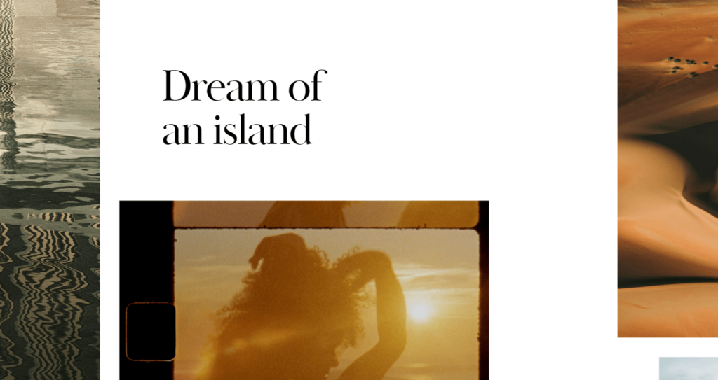
Parallax scrolling
We have already discussed parallax as a general trend in UI/UX design. Today, we’ll talk about it in the context of UX best practices for scrolling.
Parallax itself is a visual technique in web design, which is characterized by the use of different moving visual layers. These are different plans in the background, which move at different speeds depending on the scrolling activity.
Parallax scrolling: Benefits
Parallax scrolling in 2022 is a great idea because of:
▫️ A wide variety of design solutions
Parallax adapts to any idea of the author. Literally. It can be either an animated burger or a three-level African sunset. This is a great opportunity to broadcast brand identity. Explore why this is important in our branding glossary.
▫️ Dynamism
Parallax adds action to your site. Sometimes you really want to play with the scrollbar, because the picture moves in a very interesting way depending on the page scrolling. This can work great to increase the interactivity of the site.
Parallax scrolling: Potential problems for UX
Check out the potential difficulties in using parallax scrolling:
▫️ Longer loading time
Due to the large volume of animations contained in parallax, sometimes a page with this kind of scrolling can load up to several minutes. For some users, this is unacceptable, and they leave the site without waiting for the end of the download.
▫️ Challenging creating process
Creating a multi-level animated parallax scrolling can take a lot of resources: time, budget, and computer power. Most likely, a specialist will be needed for this.
▫️ Space overload
When all the user’s attention is focused on a comprehensive picture that they can control, the content fades into the background. You’ll have to fight for the audience’s attention with the parallax design of your website.
Useful Tips
All in all, scrolling can be both a winning addition to the design of your site, and worsen the performance of the web platform. Too fancy scrolling designs can play a cruel joke for you and distract site users from the essence of your brand. To prevent this and other deplorable consequences from becoming a reality, use our checklist of tips for implementing scrolling techniques. If the answer is “yes” – you are ready to launch your scrolling technique:
- Does the user have the opportunity to go to the desired section without viewing all the rest of the content?
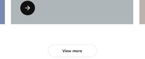
- Is there any opportunity to add a “show more” button to limit infinite scrolling?
- Is there any visual cues on the site, like arrows or visible content, for example? They help you navigate complex visual elements and understand that you just need to scroll through the page.
- Does the chosen content animation scheme work equally well on different devices?
- In general, can you rate the site as an accessible place for people with disabilities and a safe space for epileptics (for example, the design doesn’t use too sharp/flashing/rippling transitions). Learn why is it important in our post.
- Are you sure you haven’t used scroll hijacking? This is a scheme that deprives users of control over what’s happening. This is a losing strategy if users on your site can’t control scrolling or even simply don’t understand what and how the page works. This can greatly bring down the level of audience loyalty.
- Evaluate your site from an ordinary user’s point of view. Are you sure that it is not overloaded with visual elements and complex scrolling?
If you already have a grandiose idea for the design of scrolling tools on your website, we’ll be happy to help you bring it to life. A team of Figma2WP experts is at your service 24/7. Feel free to choose any complex design options for your project – we can do anything.
At a loss choosing the scrolling types or creating a design? With this or any other aspect of web development, feel free to drop us a line – the professionals of Belov Digital Agency are ready to help you.
More From Our Blog
Unlocking the Power of Visual Design in Modern Web Development In today’s fast-evolving digital landscape, the seamless integration of design tools with content management systems is pivotal for creating engaging, efficient, and brand-consistent websites. For businesses and creatives in the USA, UK, and Canada, mastering the synergy between Figma—a leading collaborative design platform—and WordPress content Read more…

When it comes to planning and designing a website, particularly for platforms like WordPress, wireframing is an essential step. It allows you to visualize the layout, structure, and user flow of your site before diving into development. Among various design tools, Figma stands out for its intuitive interface, collaborative features, and ease of use, making Read more…