
Web Accessibility
When talking of web accessibility, many tend to limit this concept to the visibility of the content on the site and the presence of the mobile version. But web accessibility stretches much further than that.
A brief table of contents, before we begin:
- The benefits of web accessibility
- Legal stuff
- What can hamper web accessibility
- What NOT to do
- What to do and which software to use
- How Figma and WordPress handle web accessibility issues
- Useful resources

An accessible digital interface is, in a broader sense, an interface that anyone can use. Ideally, you should take the word Anyone literally: any person, regardless of their abilities or disabilities, education level, age, social background – the list goes on and on – should have no problem interacting with the interface. A truly good UX is good for everyone.
A common rebuttal for the arguments in favor of all-encompassing accessibility goes: “But the number of those who might find an interface challenging is way too small to add it to the calculations!” Well, setting aside that there’s some inhumane vibe to saying so, it’s not exactly right, too.
Statistics
According to the WHO report, you exclude around 15% of the potential number of users from experiencing your service by failing to ensure web accessibility. Various disabilities can be found in around 25% of the American population, as the CDC states. Doesn’t seem like too small a number, does it? And all those people deserve the top-notch user experience.
Think of it this way: if your site seems ok usability-wise for you, it can be half as convenient – if not less – for other people. You know your functionality and the way everything works; other people don’t. Not to mention they may be physically or otherwise challenged.
Web accessibility is beneficial
What stems from everything aforementioned is that you should work on your site’s accessibility – for your own benefit. Because, aside from helping others, you improve your chances of winning the competition in your market sector.
Accessibility-driven improvements
Ensuring interface accessibility, as compared to not caring about it at all, brings you:
– More users
No exceptionally tricky logic here: the more people can access your content, the more will do so. And, as we already know from the statistics, there are more people with various disabilities or temporary sensory limitations than we’re used to thinking.
– Higher user satisfaction
How’s your customer churn doing? Sometimes (though, of course, not always), if the number of people dropping out of your service is high (or, god forbid, grows steadily), it can be due to the lack of convenience in the interface. Make it better for everyone! Think through every detail: would a visually impaired person understand the content if they couldn’t see the images? Would one be able to comfortably follow the user flow you designed?
– Improved SEO results
And that will result from many factors. First of all, you’ll simply use more keywords where it matters due to such elements as Alt tags. Header distribution also helps search engines identify the most important information on a page, thus putting you in a higher position in search results. Then, if you dig deeper, a more thorough markup with semantic HTML will be something useful. For instance, the aside tag provides microdata like author or date to display on the search results page.
Besides, the contemporary versions of search algorithms will rank your site lower it lacks the minimal required accessibility. Some changes in that aspect took place in the recent Google Core Update.
Legal regulations and WCAG
As our society progresses, we put more and more effort into ensuring equality for everyone and in everything – in the access to digital media as well. Due to such strivings, many countries adopt accessibility-oriented policies and laws. In the EU, for one, there are penalties for having a site not accessible for some groups of people. The US legislation regulates only the federal government sites; such sites should fit a set of requirements similar to those of the Web Content Accessibility Guidelines (WCAG).
This WCAG is your best friend in web design. You should use their recent guidelines edition if you’re creating any web interface. Their Accessibility Guidelines Working Group has drafted a 3.0 version that will expand to include not only web content regulations, but it’s still a work in progress. The recommended guidelines are the ones stated in version 2.1.
What is it all about?
The WCAG we mentioned above breaks down web accessibility into 4 main principles:
- Perceivable: People should be able to interact with an interface using different senses and corresponding organs.
- Operable: It should be possible to access and navigate the interface with various devices – nothing should be undoable without a mouse or from a smartphone.
- Understandable: All content must be legible and readable (which is a common-sense thing), and the user flow should be clear and predictable.
- Robust: The structure and content of any site should be readable for assistive devices like screen readers.
It’s not necessarily disabilities that limit people’s access. It can also be temporary limitations – stemming not only from health issues. The key thing here is that something prevents a person from using your service conventionally – due to not seeing or not being able to operate it.
Types of limitations
Permanent impairments are not always the only thing that keeps people from using an interface to the fullest. The famous Microsoft’s Inclusive Design 101 points out that it’s not always a medical condition at all: could be something or someone – not even the person itself – temporarily limiting the person’s abilities.
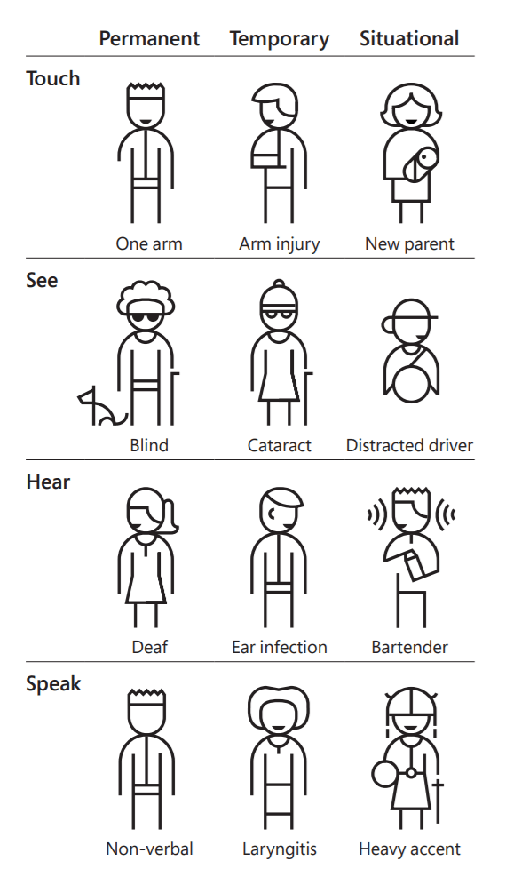
To those types mentioned, we’d also add a perceptional type, which would include limitations of cognitive, emotional or experiential nature. In other words, it’s when people can’t relate to your content for some reason.
Under some circumstances, even the healthiest human being may have their hands tied – almost in the perfectly literal sense of the word. A parent lulling their newborn to sleep or a commuter on the subway gripping the handrail tight – best-case scenario, they have only one hand free. To achieve maximum accessibility of a web interface, you need to take them into account, too.
Personas
In building an accessible interface, it helps if you pull everything about your target audience together into system. You probably already know about personas – exaggerated personality descriptions that combine the key traits of your target customers. You build interfaces around personas, mostly focusing on one with the main traits and a few others.
After you designed the concept, it’s time to ensure its accessibility – use personas for that, too. Any person with any capabilities or lack of them should be able to use the interface from any device, day or night, in public or in private.
Typical web accessibility mistakes
1. Assess interfaces from your viewpoint
It’s crucial to keep in mind who will be using the interface. That includes not only the personas you sketched based on the market analysis. Think of people in all the great variety they come in our world. Put yourself in the position of disabled people – and variously disabled, too – don’t limit your testing to the visual impairments (check with what other types of impairments people may be facing). Go further and consider the limitations of the means of surfing the web or different circumstances that can hamper the user experience.
2. Doing it for the sake of box-checking
Accessibility-related measures and routines should be a part of your work process. But, just like with most of things, you shouldn’t leave out the reason for all this – the people. Someone with disabilities or limitations will visit your site – their user experience should be as much of value to you as any other person’s.
You can leave Alt tags empty if you can’t put anything informative in there; you don’t have to over-do the markup thing and put headings after every other line of text. Just make sure you did enough – and did a good job on it.
3. Not test your interfaces enough
However strong your faith in your meticulous attention is, you won’t really be on the safe side if you don’t run automated checks on your work. We all make mistakes sometimes, and if there’s great software that can test your product, why not use it? It can save you a great deal of trouble fixing and redoing some things later.
Web accessibility solutions
1. Check with the W3C (WCAG creators) list of recommendations
The general rule is to make the user flow obvious and the elements visible and readable – all of that for everyone, not just for the so-called traditional users. Here’s a web accessibility checklist that expands on this in detail: use it in your work, and you should be fine.
2. Consider all devices – navigation tools, too
Device adaptivity is something every website owner is familiar with today. Statistics say we now use more mobile devices than desktop computers for accessing the internet; so, the mobile and desktop versions are out of the question. But our smart gadgets are not the only tech devices that help us get on the web.
Mouse and keyboard are the most commonly used input devices – make sure users can navigate using either one ALONE. Pay special attention to all the hover-triggered elements: can users interact with them with a keyboard? Then, there are microphones – also input devices. Those can be of immense help for people who can’t use their hands.
Screen readers

Visual impairments often make people use screen readers – the devices that can read the interface out loud for them. Those are machines, if we can put it that way: that is, they won’t assume anything – they’ll just read whatever they see. Images? They read Alt tags you set for them. Tables? If you use any, make sure you have them in order. Otherwise, try to refrain from purely decorative tables. And so it goes – you get the point.
Fun fact: Screen readers can mess up initialisms if you don’t separate initials by periods. This is where the WHO (World Health Organization) can turn into the who, confusing users and potentially bringing nice but irrelevant nostalgic memories of the British rock from the 70s.
That’s not to say you should write all acronyms like that. However, in some cases, you might prefer not to abbreviate the word.
The bottom line is: consider as many devices as possible. Not only the computers for accessing the internet but also input devices. Try to facilitate the use of your service for people who don’t fall into the traditional mouse-click or finger-tap category.
3. Check interactivity
Ask yourself a question: would any person be able to engage in the dialog with your product? More specifically:
- Do you use web accessibility-adapted CMS, theme and templates?
- Can people zoom into the page 200% without having to scroll horizontally (Tip: that would involve using narrower text blocks and images)?
- Does your content have tags? That would be Alt tags for images (you can leave them empty for decorative images but the tags shouldn’t be missing). If Alt tags are missing, screen readers may read the file URL instead – imagine that atrocity.
- Are your forms and input fields ARIA-compliant and have appropriate semantics?
- Is it clear on which element the focus is if users navigate the site with a keyboard?
And last but not least:
- Do you not try to outsmart your users? Because that won’t do any good to the understandability of your site.
4. Make color palette reasonable
WCAG requires the minimal contrast ratio between text and its background as 4.5 to 1 for regular-size fonts. If you use a font of 24+ px or 19 px bold, this ratio can be as low as 3 to 1. Considering that all possible ratio values range from 1:1 to 21:1, the requirement is not too strict.
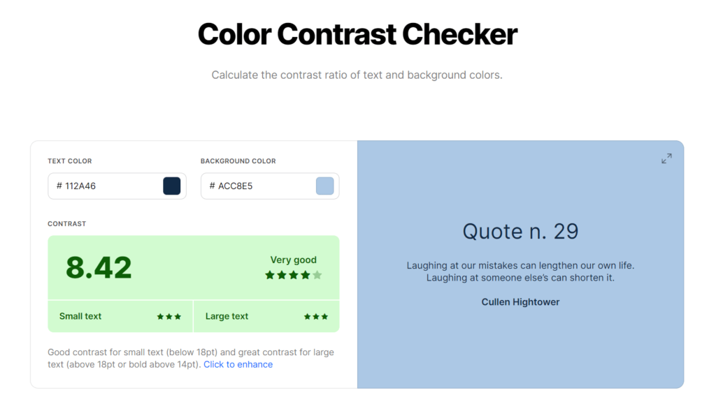
Pro Tip: How to measure contrast?
The commonly accepted way to calculate color contrast is to compare the relative luminance of both colors. There’s a formula for that, but we won’t bother you with that kind of detail. Since there’s a calculator for nearly everything, we suggest you use those. You can find multiple solutions online – pick any to your liking.
One of the possible options is Color Contrast Checker by Coolors. Provide your colors in the boxes and get the results in scores and stars for both small and big font sizes. For your convenience, the right pane will display what it looks like when used as a background & font color.
5. Adapt for the language
– Provide translation
If a statistically significant part of your users doesn’t speak the language you’ve chosen for the service, you should consider adding a version in their language. It doesn’t always have to be human-made translation: for the pages that get fewer views (during the first stages, it can be the whole service), you can stick with machine translation. It has grown considerably better over the past decade and could serve as a great starter-level help.
– Design with other languages in mind
When populating your design with buttons and menu items, think of how well those things will look like with titles and subscriptions in another language – provided that you (= your company) plan on translating it. Here, you might want to be especially careful with the sizes of objects, spacing between them and all the etceteras.
– Know your enemy target language
If the translation agenda includes Hebrew, Arabic or other languages with the right-to-left writing system, you definitely need to take that into account. Note that Chinese, Japanese and other Asian languages sometimes use vertical writing. You’re not likely to encounter that while working on a digital interface as it’s quite an old-fashioned style, but make sure that’s not going to come up unexpectedly after you’re done with the design.
Web accessibility testing software
If you decide not to rely only on your imagination (which is, by the way, good thinking), use technology – there’s a solution for everything these days. They will help you experience your site the way people with disabilities do.
Here are a few resources that will help you find the weak points in the accessibility of your design:
- Color Contrast Checker
- Color Safe for colors
- Text Legibility for your typography
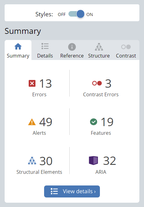
- WAVE Web Accessibility Evaluation Tool (all-encompassing test with a detailed report)
You can also use the Funkify Chrome extension: it simulates a state of having a disability for you. That way, you can get the experience other people will be getting first-hand.
Figma & Web accessibility
Since Figma is a designer’s tool, the accessibility of an interface created in it is mostly up to the designer. However, one can find lots of plugins to help with it. They will ensure your design
- has the right color contrast and accessibility-ready color palettes
- shows focus state for keyboard users and screen readers
- uses ample-sized touch target areas
- isn’t likely to trigger an epileptic seizure
and assist you with other necessary checks. And you aren’t limited to using just the ones from above! There are many more other accessibility plugins for you to install. An all-in-one solution would be the Stark plugin, which is also available for Sketch and XD.
WordPress & Web accessibility
Being one of the most widely used CMSs, WordPress is committed to ensuring accessibility in all their products. Besides, WordPress works awesome with Figma designs and allows for pixel-perfect conversion.
Even though WordPress cannot guarantee that every theme and plugin created by the community is compliant, there is the Accessibility-ready tag for the search filter: use it to find the one that fits the requirements.
That makes the lives of WordPress site owners easier: less work for them, at least in terms of the accessibility of their interfaces. Say, you didn’t provide an Alt tag for an image; that wouldn’t count as a missing Alt tag. It would be empty, which is a huge difference for assistive technology like screen readers: they wouldn’t try to read a URL or image name instead.
All recent updates on WordPress must comply with the WordPress Accessibility Coding Standards. Basically, it requires all WordPress products to meet the WCAG 2.1 AA guidelines; the Gravity Forms plugin, for one, has taken an especial effort in that direction with their recent update.
The WordPress community has a lot to offer with 50 000 + plugins, and web accessibility enhancers are certainly among those. A couple of free ones we can recommend are:
- WP Accessibility triggers such things as visible focus state or skip links when an assistive device is used and fixes some core web accessibility issues as well.
- One Click Accessibility does similar things and provides a somewhat handier color & visibility functionality for your text and visuals.
And, of course, you can find a lot more plugins that provide everything needed and beyond.
Once again: test your product!
Instead of the summary word, we’ll remind you of the importance of checking your work. Don’t underestimate the power of running a few final tests: even if you feel you’ve done everything right, it never hurts to check.
And don’t forget to add web accessibility checks to your QA/testing routine. Test with multiple different people and make sure they get more or less equal experience, regardless of devices used, navigation type, etc.
Hope you succeed in this noble feat of making the web world more accessible!
List of resources
- The Web Content Accessibility Guidelines (WCAG) and their guidelines version 2.1
- Version 2.1 (published)
- Version 2.2 (working draft)
- Version 3.0 (most recent working draft)
- The Microsoft’s Inclusive Design 101 (available for free download)
- A First Review of Web Accessibility – an accessibility checklist by W3C
- ARIA standards for the semantics of dynamic content
- Figma plugins for accessibility:
- Color Contrast Checker
- Geenes for accessibility-ready color palettes
- Focus Orderer for keyboard users and screen readers
- Adee Comprehensive Accessibility Tool
- Epilepsy-safe plugin for multimedia
- Stark (all-in-one, also available for Sketch and XD)
- WordPress Accessibility Coding Standards
- WordPress plugins for accessibility:
- Color checkers:
- Funkify Chrome extension (disability simulator)
- WAVE Web Accessibility Evaluation Tool (all-encompassing test with a detailed report)

More From Our Blog

Why Seamless Design and Performance Matter in Travel Web Solutions In the digital age, travel websites are more than just online brochures; they are the gateways through which travelers explore and decide. An effective travel website must combine visually appealing design with seamless functionality to engage users and convert visits into bookings. This is where Read more…

Streamlining Your Content Workflow with Figma and WordPress For digital content creators and web developers, the seamless planning and implementation of content is critical to launching and maintaining an engaging website. Leveraging Figma2WP Service for your WordPress content planning provides a dynamic way to align design with functionality, optimizing your entire content strategy from concept Read more…