Why is Figma the #1 Choice for WordPress?
We always say we love WordPress as a platform for web development. But, along with that, we can’t leave out the fact that designing on WordPress is far less handy. And that’s completely fine! It’s even better to keep such things separate if you’re aiming to create a top-scale product. One-fits-all solutions lack the features you find in specialized tools in most cases.
For our interface designs, we use Figma – and we’d recommend it to all and everyone!
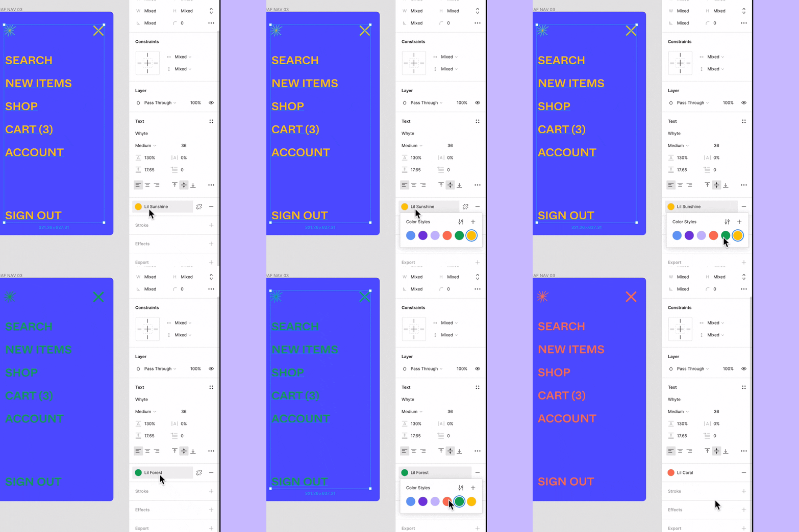
With as much choice as we have now, it can be tough to make up your mind on the tools. There’s Sketch, which has been around for a while and seemed to be #1 among interface designers. Then, there’s Adobe XD that literally has EXperience Design in its name. And Figma that so many people have been talking about recently.
If you’re new to UX/UI design, you can start with reading through our article comparing the biggest players in this market – there are lots of details about each one. As we said, we vote Figma – and here’s why.
Advantages of Figma
More than cross-platform
Figma is browser-based, which takes away the need for a specific OS. Even though many (if not most) professional designers have Macs, it’s not always true for the non-pro folks who design their websites.
“Wouldn’t the app have much more lags and hitching effects, being based online?” That’s some logical skepticism, and – not gonna lie – we had our concerns of that kind at first, too. Until we actually tried Figma. Turns out they’ve done a great job on smoothing out all such roughnesses of the UX and keeping an eye on how everything works. And just in general, Figma is on a B+ level in terms of resource consumption compared to other competitors.
Besides, it establishes a base for another important feature – collaboration.
Collaboration tool
If you work on a project online, it’s only logical other people can work on it, too. Figma lets several editors (depending on the plan selected) share their projects and also allows an unlimited number of viewers. All these people can also comment on a specific point on the design – can be extremely helpful in working on the complicated parts.
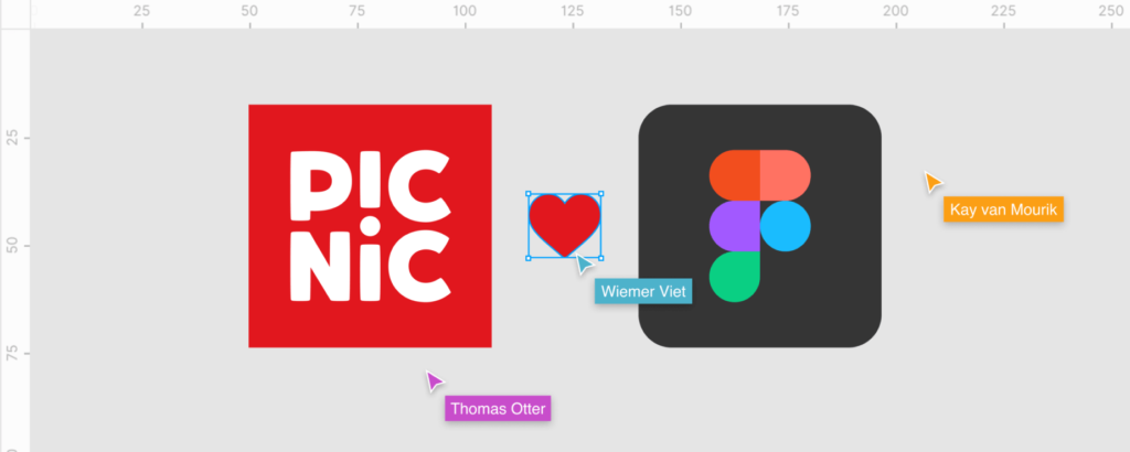
But single players of web design can also enjoy all the benefits of working in Figma. You don’t have to make your masterpiece available to the general public. Your coworkers will get access to the project only as long as you, its author, invite them to view or edit. So, rephrasing Figma itself, if you don’t want a bunch of people in your design, you don’t have to have them there.
It doesn’t even have to be a team of designers that collaborate on a project; an entire web dev crew can be in the process. That will not only help keep everyone updated on the progress, but it will also make the handoff to the developers easier – and that leads us to the next thing we like about Figma.
CSS export
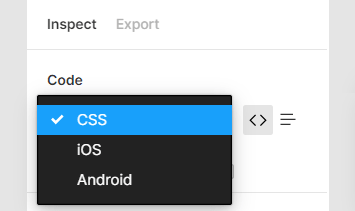
Right, there’s code in Figma! But don’t get too excited yet – you can only export CSS (as well as XML and Swift versions of the same things)*.
*There are plugins that allow you to extract markup as well, and some can even export banners and their JavaScript, but those are mostly a work in progress. We recommend you double-check the results of such export.
Here’s a bit more on how to export more than just CSS from Figma: Figma Code Export 101.
Apart from the obvious convenience of having style properties of elements in code, we’ll take a moment to appreciate how handily Figma implemented this feature. The Code tab on the right sidebar lets you select the type of code you need and toggle the desired format (Table or Code). You can just copy-paste it straight from there – simple as that.
There’s no way to export everything as code automatically – at least yet. But we know how to convert Figma designs into sites most efficiently! In just a bit of time, you’ll have your beautiful designs turned into a fully functioning WordPress site.
Prototyping
A must for creating interfaces, isn’t it?
Jokes aside, it would be nearly impossible to sketch an interface with a good UX without creating a prototype. You need to have the user flow clearly outlined; you should try out all the effects you employ before you implement them – you name it. Not to mention that it would be more comprehensible for other people who will view your design and possibly contribute to it.
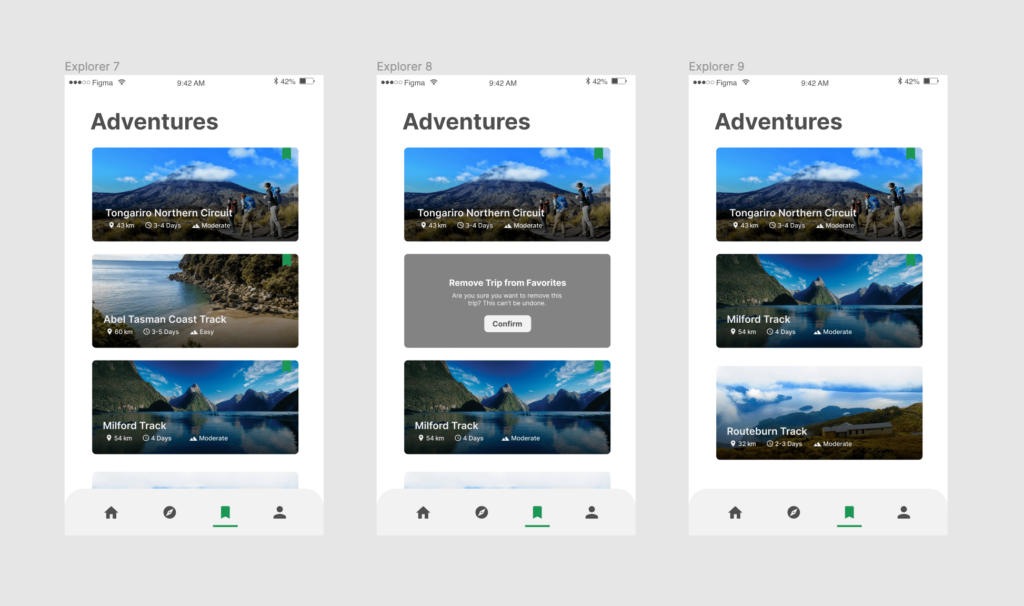
In Figma, you can build a prototype that looks exactly like a live website and does all the things it needs to do. So, no other apps like InVision and such will be necessary.
Huge Figma community
Since its launch in 2016, Figma has attracted millions of users. The community still grows, and it doesn’t sit there doing nothing, too: multiple developers contribute to Figma by creating plugins for all sorts of things not from the generic functionality.
What it means to the users new to Figma is that getting help will be no problem. With so many users, you’ll surely find someone who can help with your questions.
Also, Figma itself gives back to the community of its supporters and provides all sorts of cool benefits for students.
Free plan
Oh, and did we forget to mention that? You can use Figma for free and not feel too limited by the boundaries of the free plan. You’ll be able to do most of the things necessary for design without paying for a premium subscription.
Figma for WordPress
Apart from all the benefits of using Figma in general, some things make it a perfect fit specifically for WordPress.
The two make an excellent pair for building amazing sites. The TL;DR version of all the reasons would be that they are well adapted for each other and compensate for each other’s lacking features. Or, to be more specific:
Development-ready designs
Figma works great for all UX/UI design aspects – there are almost no limits to its capabilities in that regard. Anything – from mood boards and brainstorming spaces to full-fledged prototypes with transition effects – is possible in Figma. That means you don’t have to use a whole handful of apps and platforms to create a decent web interface – you can carry out the entire designing cycle in this one.
After you’re done designing, you just switch to WordPress for development because you already have everything you need. With only Figma and WordPress, you can do it all. And it’s even possible to stay within the free plans on both (WordPress actually charges you only if you have them host your sites).
Easy developer handoff
One phenomenal thing about Figma is you can export code from it. Not all of the code, unfortunately, but CSS is available neat and handy. Having style properties of elements in code at hand saves you lots of time, without a doubt. But, not to repeat ourselves, we’ll skip all the praises to this convenience and mention what it means for WordPress development.
You don’t need to have any additional software to pass the designs to the dev team. You can just let them in the project, and they’ll take what they need themselves. Figma also has a Slack integration: with that, their commenting functionality and code, collaboration runs so much smoother you’ll be beyond happy.
It’s easier to keep all the project-related communication in one place – less confusion, higher efficiency, work gets done faster.
Figma compensates for WordPress’s poor design capabilities
However awesome WordPress is, it was never meant to be a designing platform. To be fair, you can if you terribly want to, but that takes an awful lot of persistence and determination. Why do that if there’s a better alternative?
Which is what Figma is.
Of course, at some point, you may start feeling like you’re redoing the work done in Figma. If you plan to work with no-code plugins like Elementor, designing in WordPress will be a bit less of a bad idea than it would be with just Gutenberg – but still not the best one. Trust us: it’s so much easier to design in Figma first and transfer it to the code canvas later, adding any plugins you wish.
Relative similarity of interfaces
Figma and WordPress have editor interfaces that resemble each other in structure. Menus and sidebars, similar colors (by the way, you can change them in WordPress), even the general feeling of working online – everything seems to be from the same environment.
What’s also nice is that with neither one from this lovely couple, you’ll have to deal with high learning curves. Figma is super easy even for beginners; WordPress also won’t be a huge problem. Of course, you’ll need some time to get the hang of it if you try them for the first time, but you’ll get there fast.
Deep Figma-WordPress integration
Both Figma and WordPress are the leaders in their scope of the market. The numbers speak for themselves:
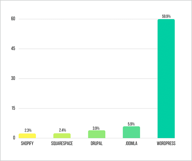
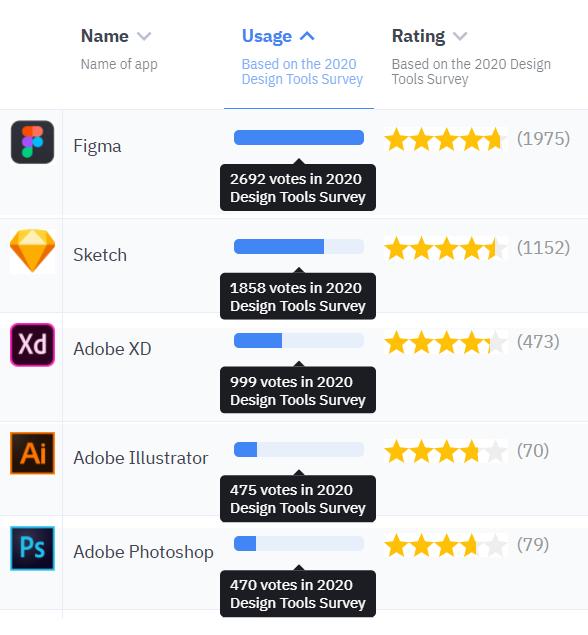
So, for both of the sides, the popularity of each one is no secret. Figma is well aware that people will likely bring their designs to life in the form of WordPress sites; similarly, WordPress knows people come to develop with Figma designs as blueprints.
That being the case, they cooperate closely and work out ways of making the work process on both platforms easier for users. Both Figma and WordPress regularly post about the whats and how-tos of each other, plus the huge community for both that will also gladly help you with advice and support.
There’s a WordPress Design Library with lots of components users contributed via Figma. Those components are elements that comprise WordPress block editor – your building bricks. Figma functionality allows designing every smallest detail necessary for creating a block. Besides, the fact that WordPress itself uses Figma speaks volumes.
You can even contribute to this Library yourself. After you design the piece you want to add, you need to ping the WordPress #design channel on Slack. Thus, you can browse, find the ones that might be interesting to you and add your works to the library of the WordPress Components, helping this system develop even further. You can find more on how to work with the components in Figma’s documentation for components.
Figma for WordPress – good choice?
Out of all the major design platforms, Figma is the top choice of the most people in the industry. It runs on an optimal amount of resources, lets you build animated prototypes, displays CSS and ensures the most efficient real-time collaboration imaginable.
We love Figma, too, and can totally recommend it even for beginners – better yet, especially for them! It is comprehensible, well-thought-through both in terms of the look of the interface and functionality-wise, and you can use it on any computer.
It fits WordPress perfectly: it does all you can’t do (or would struggle a lot doing) in WordPress, allows for a seamless developer handoff and cooperates with WordPress itself. Besides, we can convert Figma designs to WordPress sites operating at full blast – and we do it fast and pixel-perfect.

More From Our Blog
Elevating Your Online Presence Through Engaging Social Design and Community WP Building a vibrant community WP (WordPress) site is increasingly crucial in the digital age for brands aiming to foster trust, loyalty, and dynamic interaction among their customers. By integrating Figma2WP Service solutions, businesses can transform precise figma social design prototypes into powerful WordPress-based discussion Read more…
Designing Engaging Virtual Events with Figma Templates Virtual sessions and webinars have become central to business, education, and community engagement worldwide. As organizations seek smoother, more professional ways to host online events, leveraging powerful design tools like Figma can elevate every aspect of your webinar—from invitation to follow-up. Whether you are building your webinar landing Read more…


