
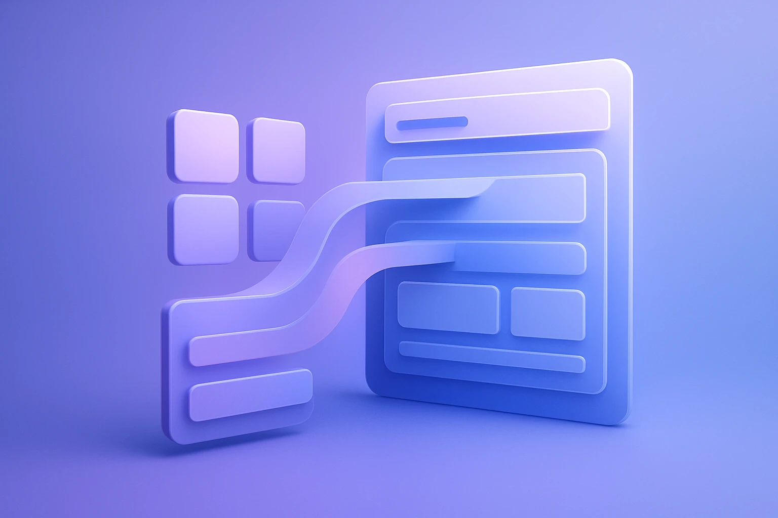
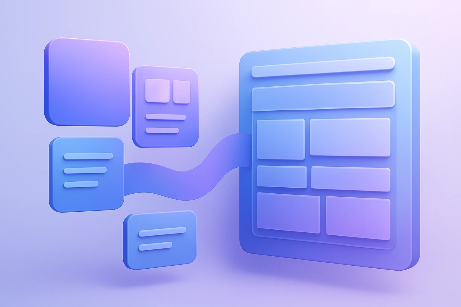
Figma to WordPress Responsive Implementation
Why Figma Responsive Designs Demand Expert WordPress Conversion
In today’s digital landscape, where users access websites from desktops, tablets, and smartphones seamlessly, mastering figma responsive techniques is non-negotiable for designers and developers alike. Converting these intricate Figma designs into a fully functional WordPress responsive design ensures your site not only looks stunning but performs flawlessly across all devices. At Figma2WP Service, we specialize in bridging this gap, turning static prototypes into dynamic, pixel-perfect WordPress sites tailored for USA, UK, and Canada markets.
Imagine a hero section in Figma that elegantly stacks on mobile—without proper implementation, it crumbles on real devices. This post dives deep into the art of figma responsive implementation in WordPress, sharing actionable steps, tools, and real-world insights to elevate your workflow.
Mastering Responsive Foundations in Figma Before WordPress Migration
Before any WordPress responsive design magic happens, your Figma file must be primed for conversion. Start by leveraging Figma’s powerful Auto Layout and Constraints features, which mimic real-world responsiveness.
Setting Up Auto Layout for Fluid Elements
Auto Layout in Figma allows frames and components to adapt dynamically. Select your elements—like a navigation bar or card grid—hold Shift to group them, and apply Auto Layout via the right panel. Set directions to horizontal or vertical, adjust spacing, and define padding for scalability. This ensures that when exported to WordPress, elements resize without breaking.
For instance, a three-column section can hug content on desktop and stack vertically on mobile. As highlighted in Figma’s own resources, using Auto Layout with constraints pins elements to edges, making them stick perfectly during viewport changes.
Defining Breakpoints: Desktop, Tablet, and Mobile
- Desktop (1440px+): Full-width layouts with expansive grids.
- Tablet (768px-1439px): Condensed spacing, two-column hero images.
- Mobile (375px-767px): Stacked elements, larger touch targets.
Duplicate your artboard for each breakpoint in Figma, resizing frames and tweaking constraints. Tools like Figma to WordPress plugin can then extract these directly, streamlining the handoff.
Seamless Tools and Plugins for Figma to WordPress Pipeline
Manual coding is passé—modern workflows rely on plugins and builders to achieve figma responsive fidelity in WordPress. Here’s how to supercharge your process.
Top Plugins to Automate Responsive Conversion
- Figma to Code Plugins: Export clean, responsive HTML/CSS snippets. Explore Figmentor’s guide for 2026 updates on AI-driven exports.
- Locofy.ai and Anima: These generate interactive code that adapts to screen sizes. Locofy.ai trains on your style for bespoke outputs, while Anima handles component exports effortlessly.
- Builder.io: AI-powered code gen that matches Figma’s responsiveness. Integrate with Builder.io for visual editing post-export.
Connect these via Figma’s Dev Mode, which spits out code snippets for frameworks like Tailwind CSS, as seen in advanced tutorials using Divi theme or Tailwind CSS.
Page Builders: Elementor and Beyond for No-Code Wins
For code-averse teams, Elementor or Crocoblock’s JetGridBuilder recreate Figma layers visually. Import sections, apply global styles matching Figma’s variables, and use responsive controls to toggle visibility per device. Briskstar’s workflow emphasizes media queries here: desktops get full grids, mobiles get hamburger menus.
Pro tip: Always test prototypes in Figma’s preview mode first. Resize the canvas to simulate devices, ensuring buttons remain tappable (min 44px height) and text legible (16px+).
Step-by-Step Implementation: From Figma Prototype to Live WordPress Site
Let’s break down the conversion into a repeatable process, optimized for wordpress responsive design.
Step 1: Export Assets and Code from Figma
Slice images at multiple resolutions (1x, 2x for retina). Use Figma’s Codegen for CSS properties—copy Flexbox rules directly into WordPress customizer. Plugins like Figma’s responsive library provide pre-built components.
Step 2: Set Up Your WordPress Environment
Choose a lightweight theme like GeneratePress or Astra for bloat-free responsiveness. Install a page builder, then create a child theme to safeguard customizations.
Step 3: Rebuild Sections with Responsive Controls
- Headers: Fixed/sticky with position: sticky in CSS; collapse to mobile nav using WordPress menus.
- Hero Sections: Background videos via plugins; overlay text with z-index stacking.
- Grids and Galleries: CSS Grid or Flexbox; media queries like
@media (max-width: 768px) { .grid { grid-template-columns: 1fr; } }.
Step 4: Inject Custom CSS for Pixel-Perfect Matching
In your theme’s style.css or Additional CSS:
.hero {
  padding: clamp(2rem, 5vw, 5rem);
  display: flex;
  flex-wrap: wrap;
}
@media (max-width: 480px) {
  .hero h1 { font-size: 2rem; }
}
This clamp() function ensures fluid typography, a hallmark of modern figma responsive designs.
Step 5: Testing Across Devices
Use browser dev tools, BrowserStack, or real devices. Check Lighthouse scores for performance—aim for 90+ on mobile. Iterate based on heatmaps from tools like Hotjar.
Real-World Case Studies: Success Stories in Figma to WordPress
Take Sarah, a freelance designer from Toronto, Canada. Her e-commerce Figma prototype featured a complex product grid. Using Contact Us at Figma2WP, we converted it to WordPress with Elementor Pro. Result? 40{75933116aeeb03ee8a3ec72bbd3559c30611f97271ef63810777e59368b3946f} faster load times and perfect mobile sales funnel, boosting conversions by 25{75933116aeeb03ee8a3ec72bbd3559c30611f97271ef63810777e59368b3946f}.
In the UK, a London agency handed us a SaaS dashboard Figma file. We implemented Tailwind CSS for wordpress responsive design, integrating dynamic charts via ChartJS plugins. Clients reported seamless tablet usability during demos.
USA-based realtor Mike’s portfolio site from Figma became a Divi-powered WordPress beast. Auto Layout hero adapted flawlessly; search overlays (inspired by advanced Tailwind tutorials) engaged users on all screens.
Overcoming Common Pitfalls in Responsive Conversions
Avoid these traps:
- Over-Reliance on Plugins: They speed up but demand manual tweaks for custom animations.
- Ignoring Performance: Compress images with Smush; lazy-load via native WordPress.
- Breakpoint Mismatches: Align Figma’s (e.g., 375px mobile) with WordPress theme defaults.
- Accessibility Oversights: Ensure ARIA labels and keyboard nav; test with WAVE tool.
For complex interactions, blend manual coding with builders—export from Figma, refine in VS Code, deploy via Duplicator.
Elevating Your Workflow with Advanced Techniques
Go beyond basics: Use Figma variables for theme switching (light/dark modes) and sync to WordPress via CSS custom properties. Integrate Gutenberg blocks for content editors. For e-commerce, pair with WooCommerce—its responsive grid handles Figma-inspired shops effortlessly.
Explore YouTube miniseries on Divi for Figma or 10-minute responsive Figma tuts for visual learners.
Partner with Experts for Flawless Execution
While DIY is empowering, professional services like Figma2WP Service deliver production-ready sites faster. We’ve handled 1000+ conversions, ensuring figma responsive integrity every time. From initial audit to launch, we optimize for speed, SEO, and conversions.
Ready to transform your Figma vision? Contact Us today—let’s craft a WordPress responsive design that captivates across continents.

More From Our Blog
Mastering the Translation: Bridging Figma Components to WordPress Blocks The core challenge of converting a design from Figma to WordPress lies not in the tools, but in the logical mapping of figma components to WordPress blocks. This process, often called design mapping, requires a designer or developer to interpret the visual hierarchy created in Figma Read more…
Transforming Visual Design into Scalable Code with Design Tokens The handoff from designer to developer has historically been one of the most painful bottlenecks in web projects, often resulting in inconsistent colors, mismatched typography, and hours of manual refront. However, the integration of design tokens into a WordPress workflow using Figma tokens has revolutionized this Read more…