
Creating Adaptive Microinteractions Based on User Stress Levels
Crafting Stress-Responsive UI: A Guide to Calming Design
In today’s fast-paced digital world, user stress levels can significantly impact how individuals interact with digital products. Creating adaptive microinteractions that respond to user stress levels can enhance the user experience, reduce anxiety, and foster a more positive engagement. Here’s a comprehensive guide on how to achieve this using tools like Figma and WordPress.
Understanding User Stress and Its Impact on UI
User stress can arise from various factors, including complex navigation, slow loading times, and cluttered interfaces. To mitigate these issues, designers must understand the psychological impact of their designs on users. For instance, incorporating elements of nature, such as plants or landscapes, can create a serene and relaxing atmosphere, as seen in apps like BetterMe which uses natural themes to enhance meditation experiences.
Key Principles of Responsive Design for Stress Reduction
Responsive design is not just about adapting to different screen sizes; it’s also about creating a user-centric experience that minimizes stress.
Fluid Grid Systems and Flexible Images
Using fluid grid systems and flexible images is crucial for responsive design. These elements ensure that the layout and visual content adjust proportionally to the screen size, maintaining readability and accessibility across devices. For example, employing relative units like percentages instead of fixed units like pixels allows the layout to adapt seamlessly.
Media Queries and Breakpoints
Media queries are essential for applying specific CSS styles based on device characteristics such as screen size, resolution, and orientation. Identifying and optimizing breakpoints for different devices (smartphone, tablet, desktop) ensures that the design adapts to provide the best possible user experience. A mobile-first approach, where you design for the smallest screen first and then scale up, is highly recommended.
Minimalism and Content Prioritization
Minimalism is a key best practice for responsive web design. Reducing content clutter makes it easier for users to read and digest information, especially on smaller screens. Prioritizing essential content and hiding non-essential items can significantly reduce user stress. For example, using progressive disclosure and navigation drawers helps users access needed items first.
Designing Calming Microinteractions
Microinteractions are small animations or responses to user actions that can greatly enhance the user experience. Here are some tips for designing calming microinteractions:
Use Calming Colors and Typography
The Sensate app is a great example of how calming colors and typography can reduce stress. Using a clean and minimalistic design with soothing colors can create a visually relaxing experience. Consider using pastel colors, soft gradients, and clear typography to promote relaxation.
Personalization and User Control
Personalization can give users a sense of empowerment, which can significantly improve their emotional well-being. Allowing users to customize their experience, such as choosing between dark or calm modes, puts the control in their hands. For instance, Instagram’s calm mode allows users to set times when they don’t want to receive certain types of content, creating a personalized and stress-free environment.
Real-Time Feedback and Biofeedback
Providing real-time feedback and biofeedback can help users monitor and manage their stress levels. The Sensate app, for example, offers guided meditations, heart rate variability training, and breathing exercises, all of which provide immediate feedback to help users relax and reduce stress.
Implementing Stress-Responsive UI in Figma
Figma is a powerful tool for designing responsive and stress-responsive UIs. Here’s how you can implement these principles in Figma:
Using Figma’s Auto Layout
Figma’s Auto Layout feature allows you to create responsive designs easily. By using flexbox principles, you can ensure that your designs adapt to different screen sizes without manual adjustments. This feature is particularly useful for creating card interfaces that are easy to move around and resize.
Prototyping and Testing
Creating and testing multiple interface prototypes is crucial for ensuring that your design is both functional and intuitive. Figma’s prototyping tools allow you to simulate user interactions and test your design across various devices and breakpoints. This iterative process helps in refining the design to better meet user needs and reduce stress.
Transitioning to WordPress with Figma2WP
Once you have designed your stress-responsive UI in Figma, transitioning it to WordPress can be seamless with the help of services like Figma2WP.
Benefits of Figma2WP
Figma2WP converts your Figma designs into fully functional WordPress themes, ensuring that your responsive and stress-responsive design elements are preserved. This service saves time and effort, allowing you to focus on refining the user experience rather than dealing with the complexities of web development.
Ensuring Responsiveness in WordPress
To ensure that your WordPress site remains responsive, you can use plugins like WPBakery Page Builder or Elementor, which offer responsive design tools. Additionally, optimizing images and using SVGs can help in reducing load times and maintaining a smooth user experience across different devices.
Case Studies and Real-World Examples
Several real-world examples demonstrate the effectiveness of stress-responsive UI design:
Sensate App
The Sensate app is a prime example of how a well-designed interface can reduce stress and enhance well-being. By incorporating guided meditations, music therapy, and biofeedback, the app provides a comprehensive solution for managing stress levels.
BetterMe
BetterMe uses natural themes and meditation experiences to create a calming atmosphere, helping users maintain high levels of concentration and reduce stress.
Summary and Next Steps
Creating adaptive microinteractions based on user stress levels is a nuanced but rewarding process. By following the principles of responsive design, incorporating calming elements, and using tools like Figma and WordPress, you can significantly enhance the user experience and reduce user stress.
If you’re looking to transform your Figma designs into responsive WordPress sites, consider reaching out to Contact Us at Figma2WP. With their expertise, you can ensure that your stress-responsive UI design is brought to life seamlessly.
In conclusion, designing for user stress is not just about aesthetics; it’s about creating a user-centric experience that promotes well-being and reduces anxiety. By leveraging the best practices outlined here, you can create digital products that are not only functional but also calming and supportive.

More From Our Blog
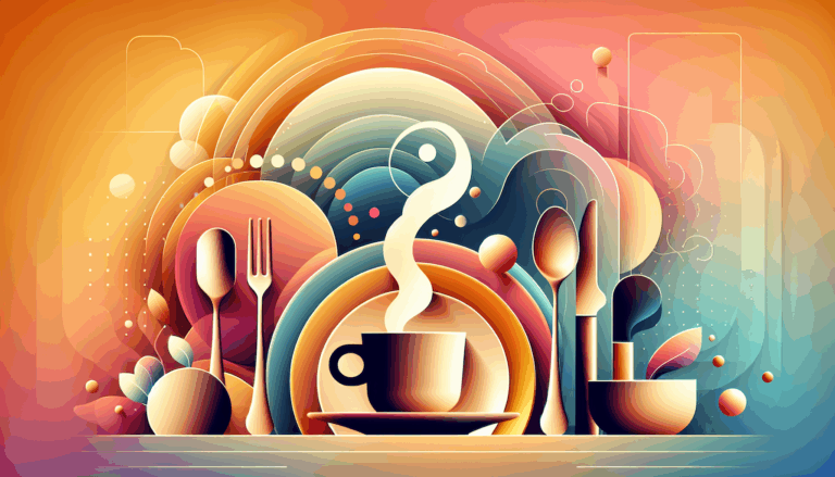
Crafting Immersive Online Experiences for Restaurants In today’s digitally-driven world, a compelling online presence can be the difference between a thriving restaurant and one struggling to attract customers. Designing an engaging food website that not only looks stunning but also converts visitors into diners is an art—and technology like Figma combined with expert WordPress development Read more…

Crafting Exceptional Real Estate Experiences with Design and WordPress Building a professional and highly functional real estate website today requires combining creative Figma property design with the powerful capabilities of WordPress. Whether you’re a real estate agent, agency, or property developer, transforming your custom designs into dynamic listing sites can elevate your business’s digital presence Read more…